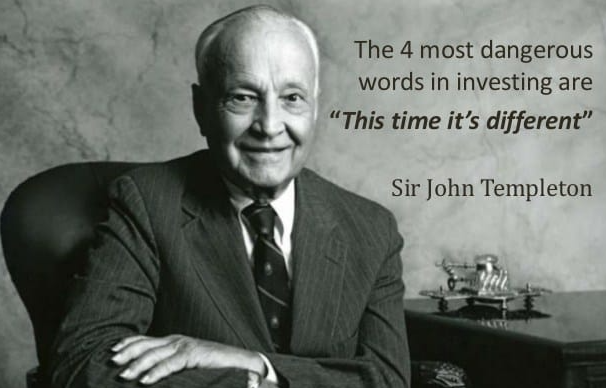
When You Hear “This Time Is Different,” Don’t Walk, Run. Rogoff and Reinhart
Every few decades, the economy’s major players develop bulletproof confidence in the
efficiency of markets and the health of the economy. Known as “this-time-is-different
syndrome,” this unrealistic optimism afflicted bankers, investors and policy makers
before the 1930s Great Depression, the 1980s Third World debt crisis, the 1990s Asian
and Latin American meltdowns, and the major 2008-2009 global downturn. Conditions
differed, but the same mindset – a dangerous mix of hubris, euphoria and amnesia – led
to each of these collapses.
In each case, decision makers adopted beliefs that defied economic history. In the 1920s,
conventional wisdom held that large-scale wars were a thing of the past, and that political
stability and economic growth would replace the volatility of the years preceding World
War I. Events quickly proved the optimists wrong. By the 1980s, economists were
convinced that high commodity prices, low interest rates and reinvested oil profits
would prop up the economy forever. Before the 2008 recession, popular thinking said
globalization, better technology and sophisticated monetary policy would prevent an
economic collapse. Every time, fiscal leaders thought they had learned history’s lessons
and that this time the economy was different.
The book This Time Is Different from Rogoff and Reinhart is one of my favorites. I believe studying history, and in this case, financial market history is vital to understanding current markets. The markets today are rallying after the Fed started the long-anticipated rate cut cycle. The Fed has termed it “normalization,” as there really aren’t any clear risks, as there have been in some previous cycles. The risks are always clear in hindsight, but looking at economic data, the warning signs are starting to appear. From my friend Julian Brigden this morning: Fundamental issue is the disconnect between stocks and bonds. The bond market is priced for a recession while equities are priced for no-landing …this is unsustainable especially because inflation isn’t defeated. Hence we are on data watch. If it’s good bonds are toast ..if it’s bad then stocks are!
Let’s look at what is happening and the potential risks going forward. Again, is this time different?
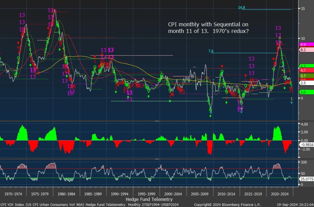
Inflation was the big risk that caused the Fed to raise rates 500bps from zero. It is mind-boggling to imagine the Fed was still doing QE and had rates at zero for as long as they did with inflation moving higher. I run DeMark indicators on a lot of data. Economic data can often be highly instructive in spotting tops and bottoms. Monthly charts take time to turn, so it’s not something you need to rush out and buy 0DTE options for some of these charts. CPI peaked with new DeMark Sequential and Combo Countdown 13s and has moved lower. It now has a downside Sequential on month 11 of 13. Looking back at history, in the 1970s, there was a surge in inflation and a drop, but it came back into the late 70s and early 80s. Both at the top and bottom, the DeMark indicators had Countdown 13’s. It was a good sentiment read when I posted on X this chart with inflation at the highs with the 13’s, and a well-known self-described sentiment expert said, “DeMark indicators as we know now don’t work for inflation.” Go pet your cats.
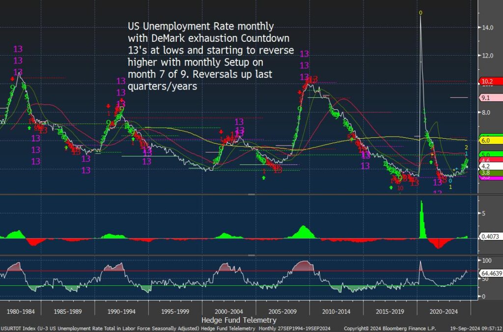
Here’s the US unemployment data also monthly time frame. Toss out the Covid period as that was a clear anomaly. What is important here is that unemployment has started to turn higher from 3.4% to now 4.2%. It’s not a red flag… yet. Importantly, when unemployment starts to turn, it tends to trend for a lot longer than the Fed, politicians, investors, and those unemployed want. In some periods when it drops off elevated levels, it can get two series of DeMark 13s. Those periods tend to start with unemployment at or well over 8%. When the 13’s on the downside occur below 5% then they tend to work more effectively. Besides the increase in the unemployment report, one thing that should be watched is the number of hours worked, which has been declining. This has historically been a precursor to layoffs as employers cut hours before laying off.
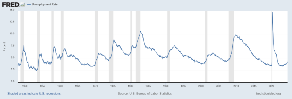
The longer-term view of unemployment shows that when it starts to rise, recessions occurred 100% each time since 1950.
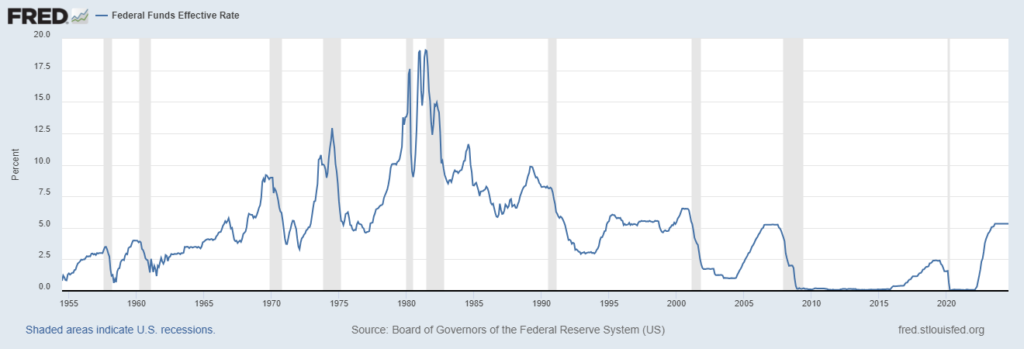
This is the long-term chart of the Fed Funds Rate showing recessions occurring after rate cut cycles start. Many people will point out the 1995 soft landing example. Besides being a one-off example, the economic setup was very different. There was a peace dividend, the internet revolution created many new jobs, and the US Debt was 10% of what it is today. And the 2/10 spread was much different in 1995.
This is the long-term view of the 2/10 yield curve spread. It was recently disinvested after spending one of the longest periods inverted. Recessions have occurred after an inverted yield curve, but it tends to have to steepen a bit more before the recession.
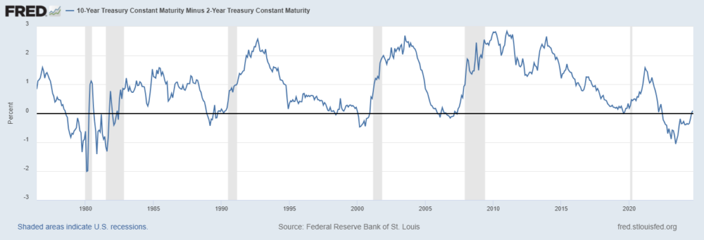
Here’s the same long-term period with the 2/10 spread and the DeMark Indicators. Again, the DeMark signals were present at the inflection points. A year ago, I was on a business program, and the interviewer asked me if the US was going into a recession with the curve inverted. It had to buy Countdown 13’s with the 2/10 -100bps. I stated that recessions rarely start when the curve is inverted, but when it disinverts, US recessions tend to start.

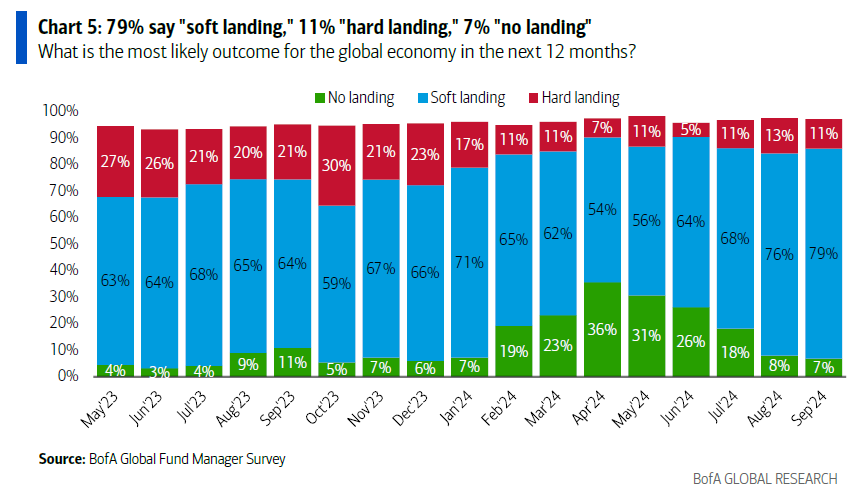
The Fed has now stated that it plans to cut rates more to stem the economic risks. The takeaway was how Powell sounded so confident yesterday. The market believes the Fed can do this, but history is not on the Fed’s side. Interestingly, the markets strongly believe in the soft landing scenario. Most miss looking at the economic data, and if the equity markets pull back, those in the Bank of America fund managers survey will backed off of the soft landing scenario. Investors seem to measure the soft landing only if stocks go up regardless of history.
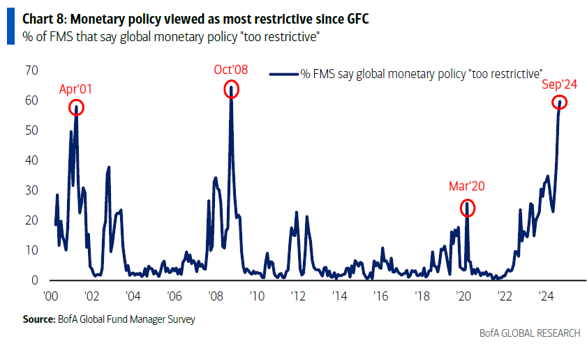
I posted this one the other day, yet it’s good to revisit as I have stated the over-reliance on the Fed cutting rates to support stocks is blind to the risks of the Fed failing to keep the equity market party going. The financial conditions data has been lower (looser vs tight) vs. when the Fed started raising rates, with the markets ignoring the 500bps of hikes. Again, valuations are not cheap, and the risk of the Fed failing is higher than in these other periods, considering the markets were down significantly when they felt the Fed was too restrictive. This chart might be the one we can look back in hindsight of how the markets were too reliant on the Fed.
Quick Market Views
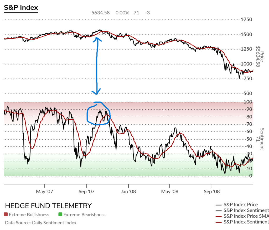
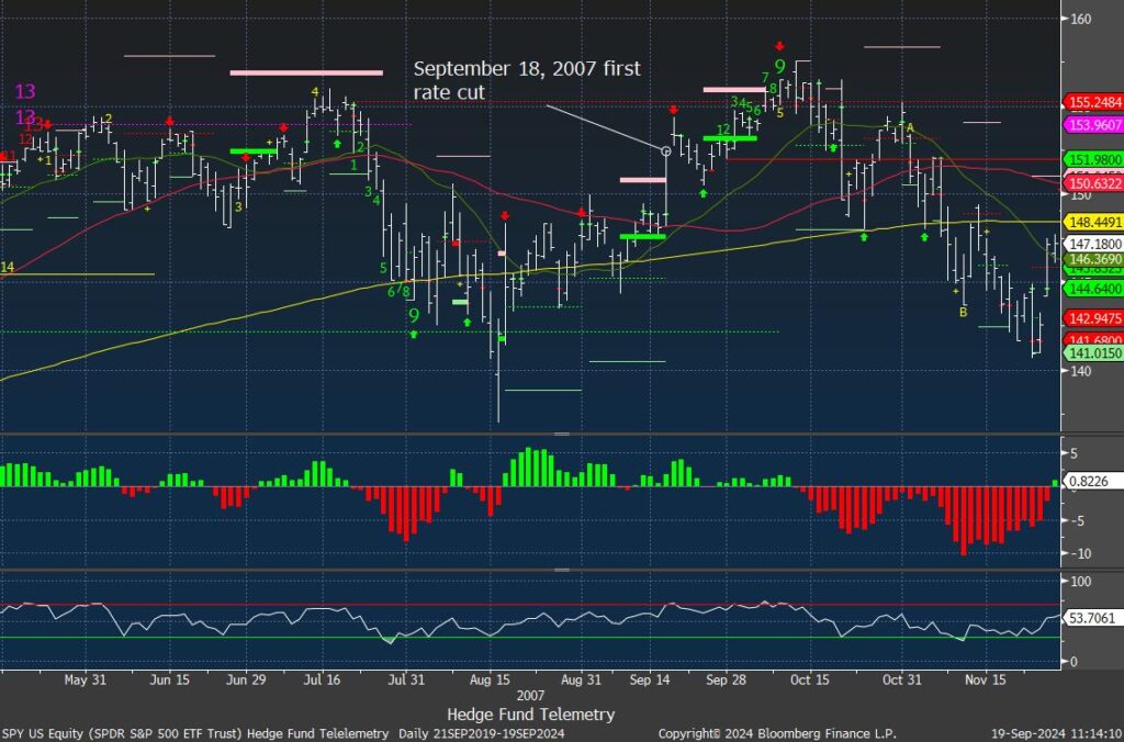
Stocks: The post Fed reaction is euphoric led by the Mag 7 which has relatively underperformed since July peak. Breadth is solid with NYSE up 2300 issues and Nasdaq up 2200 issues. It’s possible this can continue for a little longer despite the second half of September being a weak seasonal period. Seeing a lot more sell Countdown 13’s and sell Setup 9’s again on the screens while the indexes could have a little more upside before getting exhaustion signals. Equity sentiment should get back into the extreme zone later today or in the coming days. I posted the S&P sentiment from when the Fed started a rate cutting cycle in 2007 and it doesn’t look that different.
Bonds: The 2/10 yield curve spread is now at +13bps. I expect this to continue to steepen. 2’s are down nearly 1bp, 10’s up 4 bps, and 30’s up 5bps. I mentioned I could see bonds sell off after the Fed and the bond market tends to be smart money.
Commodities: Another strong day with energy and metals higher while grains are lower.
Currencies: US Dollar Index is up 0.1%. Bitcoin is up 3.3% in the risk on euphoria.
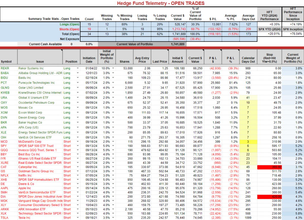
Trade Ideas Sheet: Long side doing well, shorts not so much
Changes: I increased the SPY and QQQ shorts today from 2% to 5% (I thought I had 2.5% on before)
I’m cutting some short exposure. Cutting XHB, XLK, CAT in half, removing DE, MGK. I am going to double up the recent new energy long exposure to 2% each from 1%.
Thoughts: PCT is ripping higher today, squeezing shorts that were adding yesterday and getting cocky on X. Energy continues to trade well, and BABA and China tech are strong and could continue as well. GLNG still trades well and with the new deal it should trade higher.
US Market Indexes and Sentiment
Here is a primer on how we use Daily Sentiment Index charts. Bond, currency, and commodity sentiment are posted on the website.
S&P bullish sentiment should see a move into the extreme zone >80%
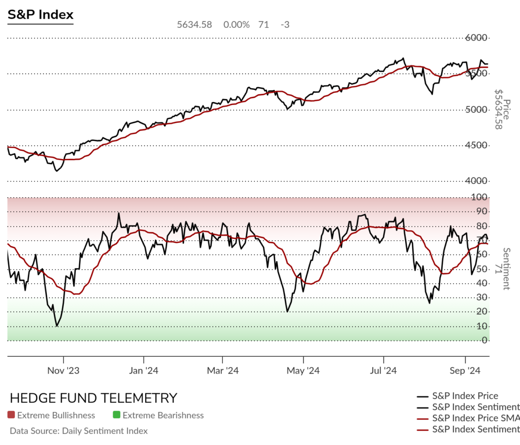
Here’s the S&P bullish sentiment in 2007-2008. After the first rate cut, sentiment increased from the high 60s to extreme levels in the 80’s. Part of the Fed’s need to cut rates back then was a decent drop in the summer with the subprime crisis at the time, which was “contained,” according to Fed chairman Ben Bernanke. You all can go back to our site and look back at other periods. There are a few gaps with a few markets but for the most part it’s useful. I posted another chart of this period below.
Nasdaq bullish sentiment should see the 80’s extreme zone later with today’s reading or in the coming days.

Here is a primer on the DeMark Setup and Sequential indicators.
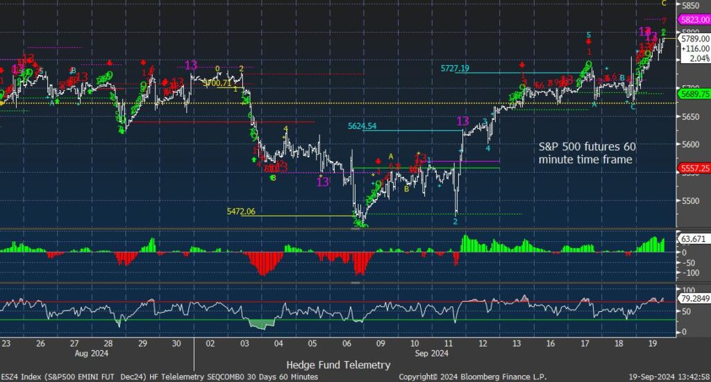
S&P futures 60-minute tactical time frame with recent DeMark Sell Countdown 13’s lacking any pause or reversal. Short term RSI very overbought.
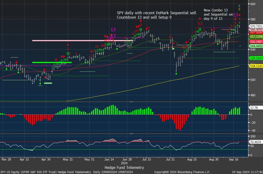
S&P 500 SPY daily with DeMark Sell Setup on day 7 of 9, Sequential on day 8 of 13 and recent Combo 13.
This is 2007 SPY showing a big pop after the start of the Fed rate cut cycle – ironically on the same day as yesterday. It lifted a little more and then the euphoria ended.
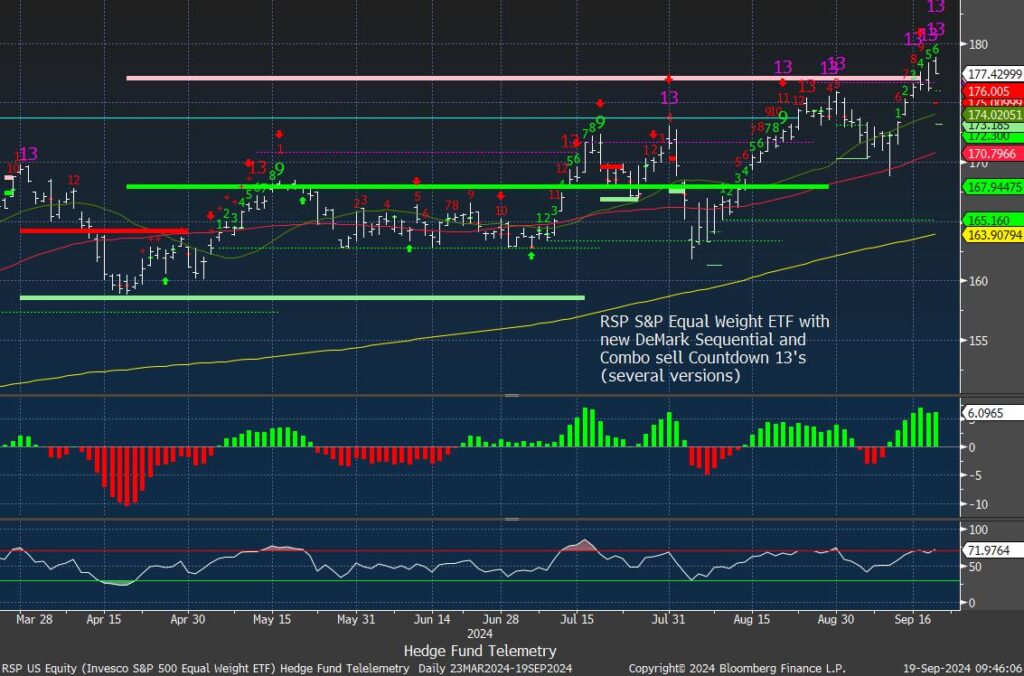
RSP S&P equal weight with several Combo sell Countdown 13’s (strick and default versions)
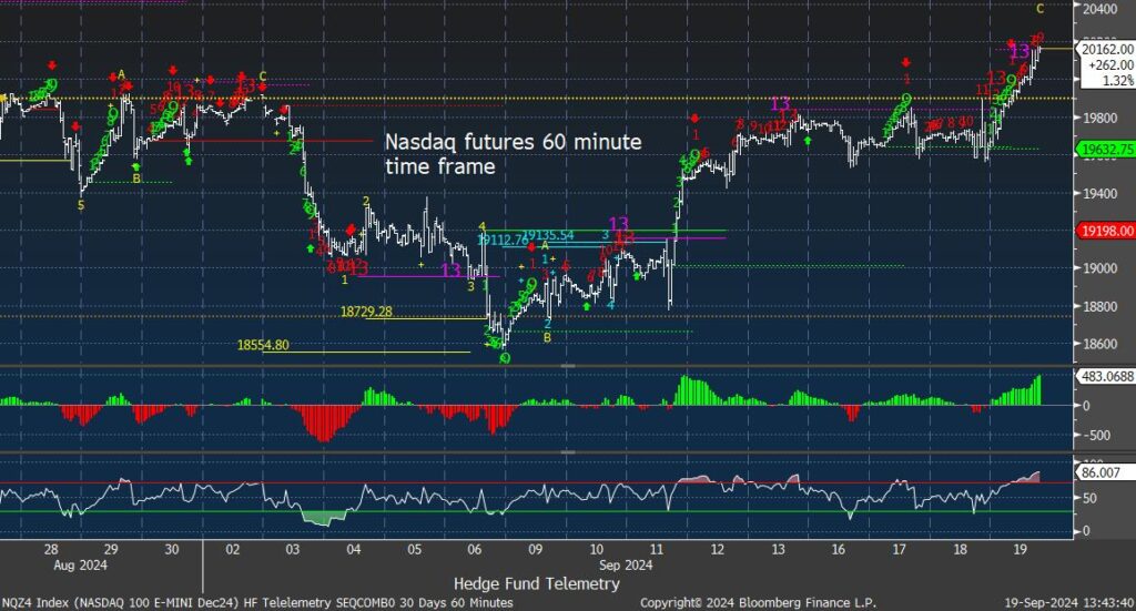
Nasdaq 100 futures 60-minute tactical time frame similar to the S&P extended but no reversal. Short term RSI at 86 is overbought and should consolidate.
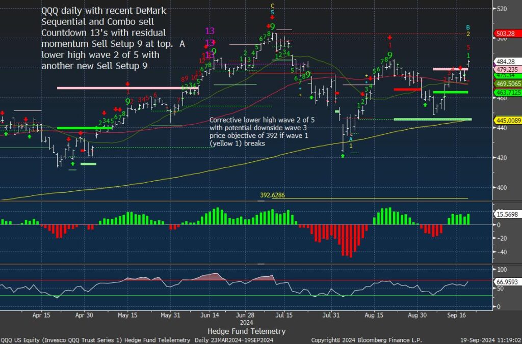
Nasdaq 100 QQQ daily strong today still with a lower high well below July peak
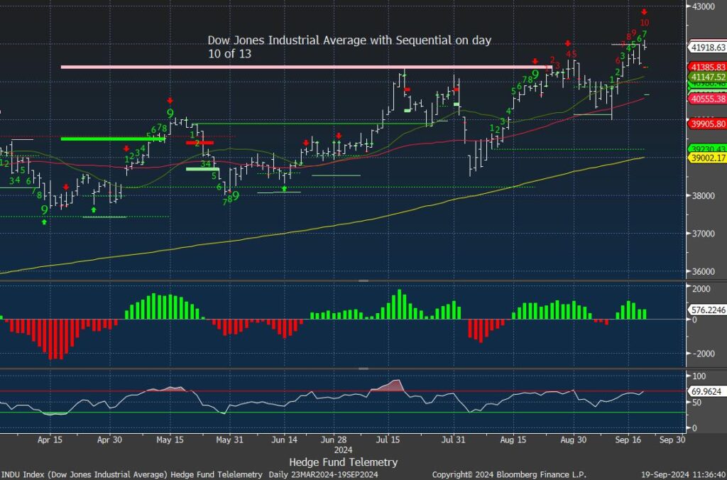
Dow Jones with Sequential on day 10 of 13 so it’s getting closer to exhaustion.
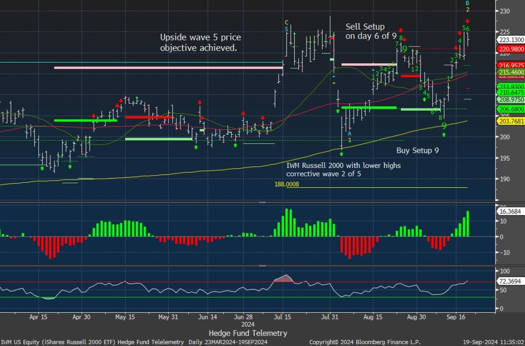
IWM Russell 200 is back to the old highs. Slightly under performing the other indexes and off earlier opening highs.
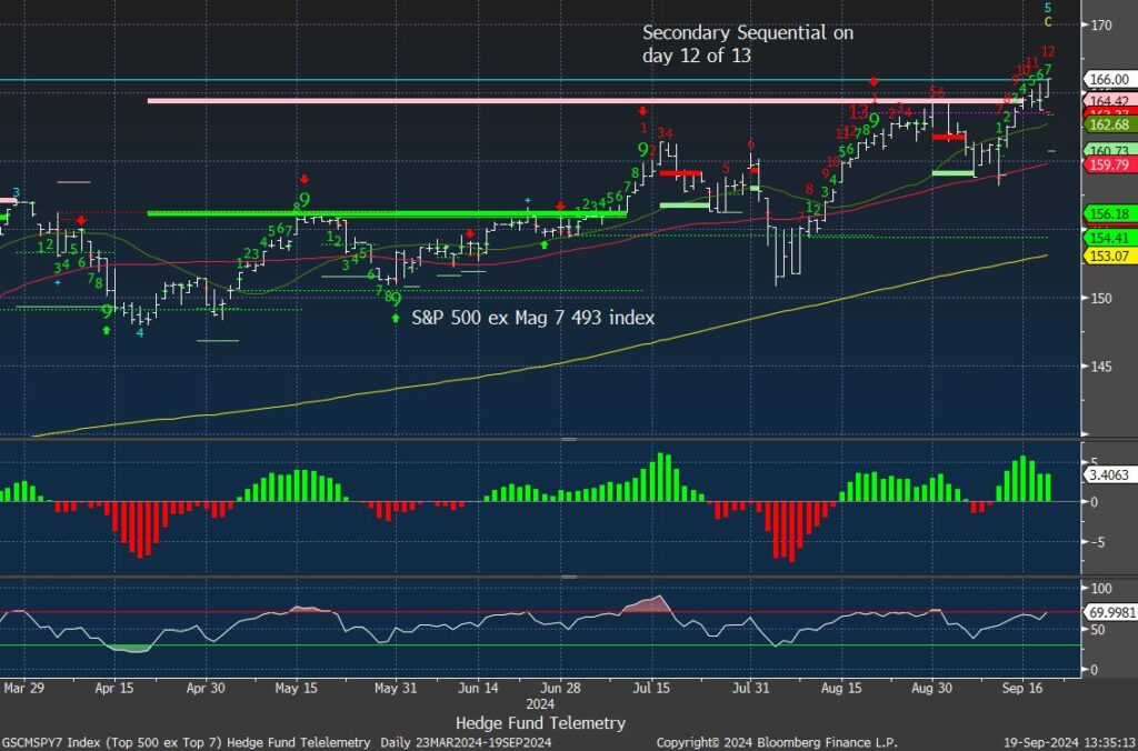
Mag 7 and S&P 493 ex mag 7 update
The Mag 7 has lagged since July peak. A big upside day today.

S&P 493 ex Mag 7 is also up today but not nearly up as much as the Mag 7. The DeMark Sequential is on day 12 of 13.
Trade Ideas Sheet
Pre changes
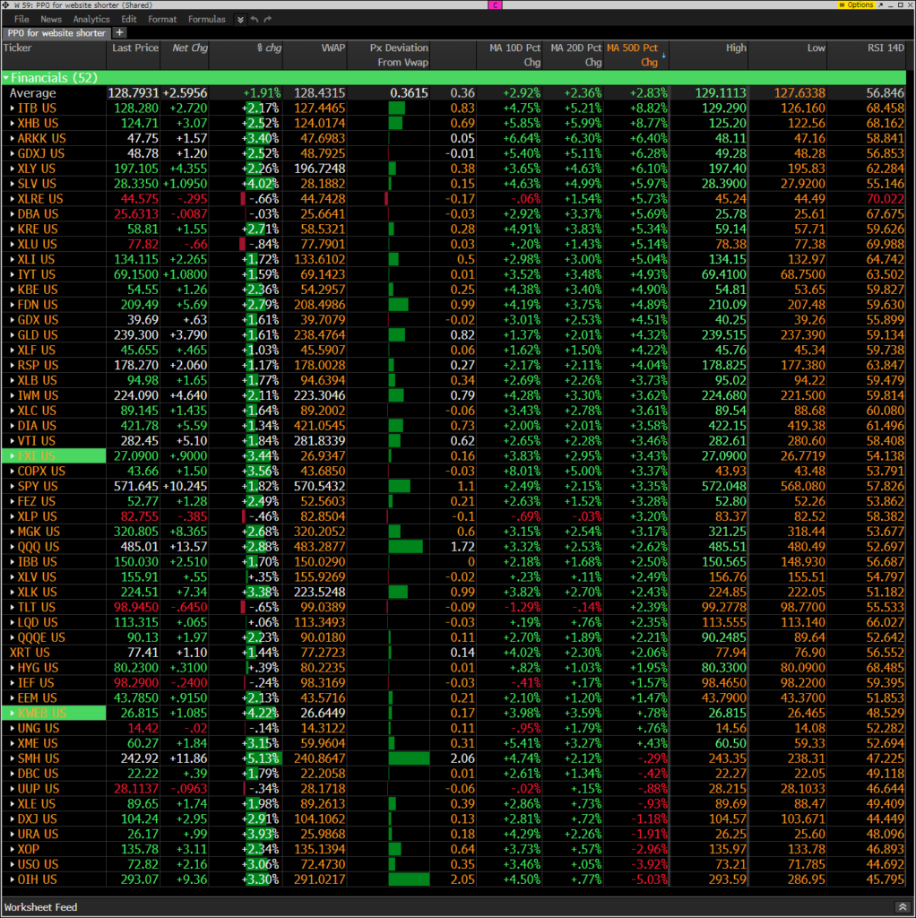
Hedge Fund Telemetry ETF Percentage Price Oscillator Monitor
The PPO monitor (percentage price oscillator) force ranks ETFs by percentage above/below the 50-day moving average. For information on this monitor, please refer to this primer. This monitor and others are offered to Hedge Fund Telemetry subscribers on Bloomberg. Broad strength ex real estate, utilities, staples, bonds
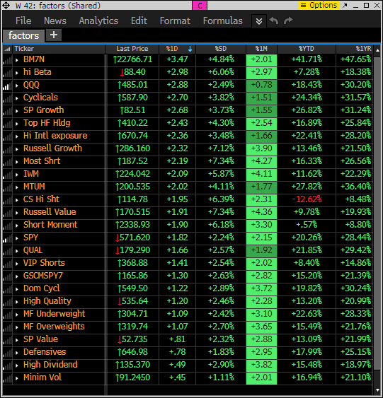
Index ETF and select factor performance
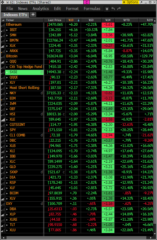
This monitor with various markets and factors ranks today’s performance with 5-day, 1-month, and 1-year rolling performance YTD. Risk on factors leading with defensive which have been strong on the lower end of the monitor.
This is a similar monitor with major ETFs. Ditto
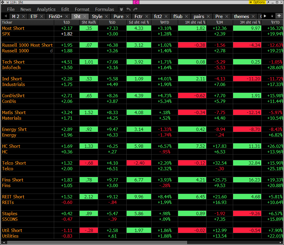
Goldman Sachs Most Shorted baskets vs. S&P Indexes
This monitor has the S&P indexes and the Goldman Sachs most shorted baskets. Short baskets are squeezing but it’s more long only buying doing the majority of the gains in the indexes.
DeMark Observations
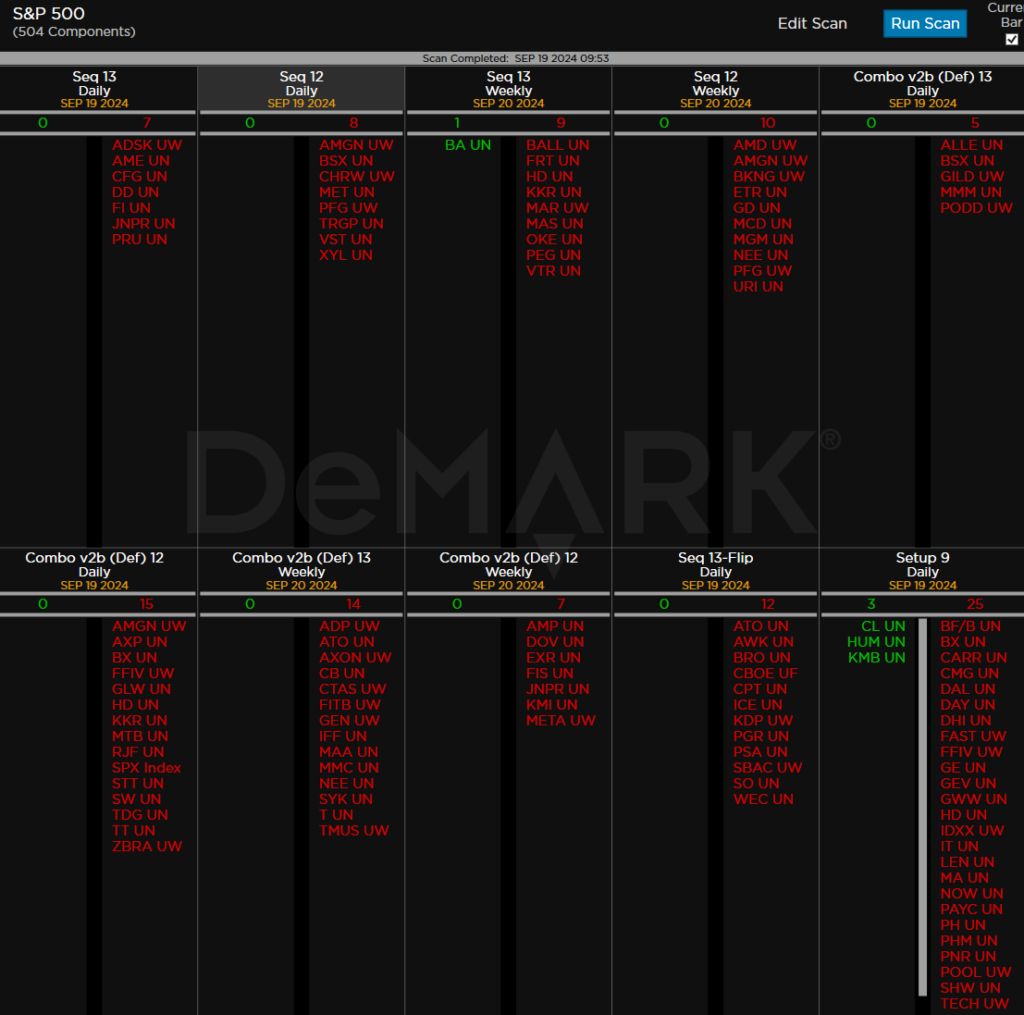
Within the S&P 500, the DeMark Sequential and Combo Countdown 13s and 12/13s on daily and weekly periods. Green = buy Setups/Countdowns, Red = sell Setups/Countdowns. Price flips are helpful to see reversals up (green) and down (red) for idea generation. The extra letters at the end of the symbols are just a Bloomberg thing. Worth noting: With the higher market, many more sell Countdown 13’s and 12/13’s as well as sell Setup 9’s developing. More downside price flips is surprising.
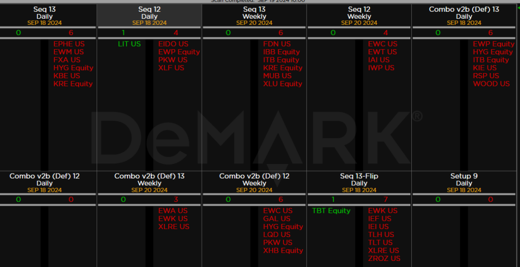
Major ETFs among a 160+ ETF universe. Some important sell Countdown 13’s – financials, high yield etc. Daily and weekly too.
If you have any questions or comments, please email us. Data sources: Bloomberg, DeMark Analytics, Goldman Sachs, Street Account, Vital Knowledge, Daily Sentiment Index, and Erlanger Research
